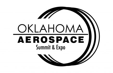
Oklahoma Aerospace
by bbenefield on May 01, 2016
Client: Oklahoma Aerospace Alliance
Project: Theme Logo
Notes: There were a few things I was trying to convey with this logo and while it was “good enough” at the time to pass along to the client, there are ways this could be improved that would have conveyed my message better. The circle was for the O in Oklahoma and the three rings were there to mimic an engine cowling as well as contrails from a plane. And then I like the way the actual logo cuts into the circle, not in a straight line but in an aircraft nose shape. I think I could have worked on this a lot more and fully implemented all these ideas. I love this logo because it reminds me to keep working on something even after you think it’s complete.


